Wednesday 17 March 2010

Tuesday 16 March 2010

7) Looking back at your preliminary task, what do you feel you have learnt in the progression from it to the full product?


Before working on the preliminary task I already had detailed knowledge with using a DSLR camera, had simple knowledge on Adobe photoshop and had no knowledge at all with QwarkXpress. The task helped me to improve the knowledge I already had on these technologies and give me a basic knowledge on the programmes I had no experience with.


I was then able to develop my use of these technologies in a more sophisticated way, this was especially noticable in my use of photoshop, in which I primarily used image manipulation as a skin perfecting tool in the preliminary task but then developed the use of the editing software in the final piece. I achieved a variety of effects I hadn't known possible before and this helped to create the right mood for my genre of magazine.


In the preliminary task I found Qwark Xpress very difficult and frustrating, however I have now become much more comfortable with it and find it easy to import images and text and organise page layouts.


2) How does your media product represent particular social groups?

3) What kind of media institution might distribute your magazine and why?

Monday 15 March 2010

4) Who would be the audience for your media product?


My magazine was aimed at aspirers, radicals and underachievers who have an enthusiastic interest in indie/folk music. I developed this genre through the research into indie-rock magazines and decided to put a twist on it. Rather than having a loud, rebellious image to them my target audience have a cool, mellow and intellectual demeanour.


I was aiming to reach students at college or university, however there would be some mature personalities in high school and therefore my target age range was 14-21 and a mix of male and female.


An example of a typical reader of an indie-folk magazine.


I asked a couple of members of my target audience on what they thought of my magazine, and here are there responses;


Name: Jess Townsend


Age: 16


Gender: Female


Music: Indie


What genre would you say this magazine is?

"Hmm, initially i'd say folk but then you've got some reference to indie in there so i'm going to say indie-folk"


What do you think of the layout?

"Yeah I like it, on the front cover the model leaning to the left balances out the information on the right and the fact he isn't looking at the camera makes him look cool"


Is there anything you would change?

"Making the model face the camera might have grabbed my attention more, and the text boxes look a little bit plain just being white."


Would you buy it?

"Yeah i'd buy it, it looks well done and proffesional and it would interest me.


How much would you pay for it?


"Hmm, the way it's done makes it look expensive-ish.. i'd say about £2.20


Name: Josh Taylor


Age: 17

Gender: Male

Music: Rock/indie/alternative


What genre would you say this magazine is?

"Folk/country"


What do you think of the layout?

"Yeah it's good"


Is there anything you would change?

"I'm not too sure about the white boxes on the front cover, and you could add a couple more images to the double page."


Would you buy this magazine?


"Yeah it looks like it would have bands that i'd like in it"


How much would you pay for it?


"£1.50"


Name: Leah Dennison


Age: 17


Gender: Female


Music: Indie/ Alternative


What genre would you say this magazine is?


"Definately folk, bit of indie?"


What do you think of the layout?


"Yeah I think it's really good, I like the main image"


Are there any changes you would make to the magazine?


"Err, maybe put in a couple more pictures on the double page?"


Would you buy this magazine?


"Yeah, probably"


How much would you pay for it?


"£1.20"


6) What have you learnt about technologies from the process of constructing this product?


Adobe photoshop Cs3

I was already familiar with this product prior to the task, however through this I have become much more comfortable using the programme and it's tools and have discovered aspects of it I didn't know about before. The reason I was already familiar with the product was through my previous use of it in my photography lessons. This proved difficult as I was use to setting my DSLR to take RAW files (which maximises image quality) however, the media rooms have photoshop Cs3 which doesn't accept RAW files and this resulted in a lot of time being wasted trying to convert the images.
Alongside my use of Adobe Photoshop, I also edited my pictures in Adobe Lightroom. Again, I was already very familiar with this product and I find this the easiest way to manipulate images.


QwarkXpress

At first, QwarkXpress looked very daunting. However, after some getting used to I found it easy to create my contents page and double page spread. The programme made it simple to include and organise pictures and text, and you don't have to worry about layers like you do with photoshop, but you must make sure your images are edited the way you want them before using them in Qwark as it is solely a programme for arranging items rather than an editing software.


Facebook


Facebook has been very useful to gain feedback from target audiences on various aspects of my magazine. It has meant that fonts, colours and images have all been looked at by members of my target audience and has helped me come to conclusions on how to develop these features.


Youtube


Youtube has been very useful in showing evidence of my research into target audiences. I was able to video target audience members, asking their opinions on my magazine, and embed the videos into my blog.


Blogger


Blogger has been my online record of my coursework, detailing everything from my initial research, to rough drafts of my magazine, audience research and finally my final magazine. This was the only technology that was new to me when beginning this task, but it was easy to use. It was simple to include text and images and after being taught once, eventually easy to embed videos from Youtube.


Nikon DSLR Camera


I used my own camera for all the images I took in my magazine and so I already knew all the features of it and how to use it.


Wednesday 3 March 2010

1) How does your media product use, develop, or challenge forms and conventions of real media products?


My media product is similar to the current magazines shown above, which all present the genres rock and indie rock. Therefore I purposefully took inspiration from these magazines as I intended my magazine to present an indie/folk genre. The similarities between my own magazine and the others listed are the typical elements of a magazine such as a masthead, barcode and strap lines but also the features specified for the genre such as the font and language. The font used in my magazine and the current ones is a sans serif font, typically used to connote colloquialism and to appeal to younger audiences. The language mine and the other magazines have used is a chatty, informal style but as well as showing intelligence.

However, my media product shows some difference in style and content because it was an indie/folk magazine. This is shown through the colour scheme being quite neutral, laid-back colours as apposed to NME’s ,for example, bright red, black and white scheme.


Friday 12 February 2010

Wednesday 10 February 2010

Tuesday 9 February 2010

Friday 22 January 2010

Time Plan

Friday 22nd January:
  • Small contents shot to be takeBulleted Listn, image of two people in a pub/club, smiling.

Saturday 23rd January:
  • Double page spread image 1, medium close up shot of someones feet for album cover.
  • Double page spread image 3 & 4 to be taken, involving a boy and girl in quirky outfits. It will look as though they have just been pulled straight from the street even though I am using models.

Sunday 24th January:

  • Double page spread photo five, image of a boy sat in an armchair or a field if the weather is nice playing a mandelin or acoustic guitar.
  • Large contents shot: Taken in a field including a 4/5 mixed group, all with instruments.

Tuesday 25th January:

  • Front cover image to be taken, outside if the weather is good, if not in a studio.

Thursday 21 January 2010

Planning: Shot list

Cover shot: Wide shot, male model wearing a checked shirt and skinny jeans. Outside in the sun, hopefully in a field. I may get my model to pose with a quirky instrument such as a ukele. I will use my DSLR camera to take this shot.


Here are some examples of the kind of style I want in my cover image:


Large contents shot: Wide shot, landscape, group of about 4/5 young people. Various instruments will be in the shot to show that they are in a band. The picture will look very casual and natural rather than posed.

Small contents shot: Wide shot, portrait, the editor of the magazine and a band member stood next to eachother smiling with arms around one another. There should be a distinction between the editor in the shot and the band member. E.g. clothes, height, age?


Double page spread photo one: Mid shot, Image of something quirky e.g. socks with sandals? To represent an indie film.

Double page spread photo two: Wide shot, image of a crowd of people to represent a gig. I may be able to take a picture of an actual gig if the opportunity arrises.

Double page spread photo three: Wide shot, portrait, of a girl in the high street wearing desirable indie clothes.

Double page spread photo four: As above but with a male.
Double page spread photo five: A medium close up image of something herbal like to represent a herbal high, or an actual legal high if I can get my hands on one.

Double page spread photo five: I will upload a two second video clip of someone playing an instrument like a mandelin or guitar and I will then do a screen shot, crop it and then include it in my double page spread.

Audience research on rough sketches

Below is my initial draft of the front cover of my magazine. It briefly shows some of the content that I intend to include and other details such as the title, colour scheme and layout.


Here is the rough sketch of the contents page. It looks quite bare but I intend to fill the whole page with a lot of text which will include not only the content of the magazine but with a note from the editor aswell. Next to the text detailing the content of the magazine I hope to include a large image of a band with a page reference, and beside the note from the editor I plan to include a small image of something relating to the note.


Finally, this is a rough drawing of the double page spread I will include in my magazine. I decided to include a variety of information such as fashion, film and music as a result of the audience research I gathered.


Wednesday 13 January 2010

Audience Research

Below is a screen shot of my page on social networking site Facebook. Here I uploaded the image of my mood board and asked some questions relating to it to see if it is suitable for my target audience.


These are the questions and responses:

Does this appeal to you, Why?

" Yes, it has lyrics from bands I like... and features logos of magazines I already read"
"It appeals to me... it is suited to teenagers because it has images like the Topshop, Myspace and WKD logos"

Would you read this magazine? All those asked said they would
"it looks interesting to read"

What would you want it to include?

"stuff about gigs and festivals and new music"
"a mixture of fashion, music and general issues"

What do you think about the fonts?

"I like the fonts because they are varied and interesting"
" really like the fonts at the bottom"

For an uptodate view of the mood board follow this link;

http://www.facebook.com/home.php?#/photo.php?pid=4360862&id=727423277

Now that I have gathered this information, I will bear it in mind when I create rough drawings of my magazine which I intend to do next.

Tuesday 12 January 2010

Research and Planning: Distribution

There is a definate difference between major and independant distribution strategies of magazines in the UK. For example Frontline, who are one of the UK's largest distributing companies and work with the three major UK publishers, work on a very large scale, selling millions of copies per week. Their main aim is to maximise sales, and they acheive this by producing mainstream magazines, such as Take a Break and Heat which will appeal to a wide audience. They also publish Kerrang, and they make use of convergence in the media industry as it is available in other formats such as through radio, television and online. Their magazines are then distributed to large companies such as the leading supermarkets Tesco and Asda, and other big companies like WHSmiths to make it easily accessible to potential buyers and therefore maximises profits.

Contradictorally Vice, and independant UK magazine who have a very different distribution strategy. Their magazine is free, and this is because it is only distributed to places where their target audience will go and this consists of bars, cafes, record stores and galleries and is therefore not in stocked in mainstream stores such as supermarkets. This quirky way will appeal to their target audience as they will feel that they are connecting with them on a personal level.

After researching into the distribution strategies of major and independant magazines I have decided that I would distribute my magazine through independant distribution and I intend to stock it in mainly bars and cafes. This is because it will make it more personal for my audience, who are into quirky and independant music, and I think they will appreciate it.
I will have a multi platform strategy where the audience can listen to and watch independant music and films made by my company.

Sunday 10 January 2010

Audience Profile


  • Generally aged between 14 - 21 although age can vary depending on personal taste.


  • Mostly female, with some males.


  • Intelligent, but won't put as much effort in at school as possible e.g. leaves homework to the last minute.


  • Will shop at Topshop, Urban Outfitters and various charity shops.


  • They will most likely smoke, and have tried or intend to try cannabis.


  • They may have a saturday job, and spend their wages on gigs, alcohol and nights out to the cinema/ restaurants.


  • They will have a piercing somewhere, a popular choice being a plug.


  • They will have a facebook/ Myspace addiction.


  • Will be interested in unsigned bands/ interested in quirky music.


  • The girls will own at least one long cardigan


  • Both genders will own a pair of skinny jeans and a checked shirt.

  • Their favourite TV programmes will include Skins, the Inbetweeners, Misfits etc.

  • The films they are likely to favour are ones like Juno and 500 days of summer.

Summary of Research

Through my research into rock magazines, I have found that this genre of music will typically include:

  • A 3 way colour scheme, with a fourth colour used to highlight particular areas.
  • A capitalised masthead in sans serif font.
  • A main image of a popular band within the chosen sub culture looking directly at the camera.
  • Cover lines and reversed out cover lines to give the cover variety and depth.
  • A large image dominating the contents page with the actual content listed in a box to the side.
  • A lot of small text on the double page spreads with one large image and a few smaller ones.

Wednesday 16 December 2009

Mood Board

This is my mood board which contains images connoting to my chosen genre; indie folk. I intend to show this to members of the public within my target audience to see if the board is accurate.


Wednesday 9 December 2009

Research and Planning 2: Detailed Analysis (unfinished)

I intend to create an indie folk magazine, however I couldn't find any magazines within this genre and so I have analysed rock magazines as they have a similar target audience with similar conventions.

Rock sound is a rock magazine which specifically features new music. A typical audience member may generally be a male who plays an instrument and may be in a band. He will most likely wear jeans and a t-shirt and attend many parties but won't dress up for them. He is a hedonist and perhaps someone who is intelligent but probably didn't put in enough effort at school to get the highest grades he could. This person will enjoy finding new music to listen to and his favourite band will be one which produces many albums such as Muse. To appeal to this 'couldn't care less' attitude Rock Sound have included colloquial arrows and vocabulary with large in your face fonts. The colour scheme they have used is Green, white and yellow which are bright, quirky colours which will stand out. They have included a list of many bands, some of which the audience member will not have heard of and will be interested to find out about them. The main sell of this particular issue is an interview with the band Muse, who are also the main image on the cover.


Rock Tribune is another rock magazine, who include music from the sub-genre metal. The reader of this is likely to be male and, depending on their personality, would either wear jeans and a hoodie or a long black coat. They will most likely have long hair and will aspire to grow some form of a beard if they don't have one already. Their favourite band is likely to be Megadeath and they will spend their time watching Youtube videos, most likely of stunts, and playing games on the Xbox such as World of War Craft. They are quite introvert and will have a social networking site but will rarely use it.

To appeal to their target audience, Rock Tribune have made their magazine simpler and have organizationally laid it out. The front cover has a sophisticated feel to it, which is encouraged throught the use of fonts, this particular issue appears very gothic. This is because the main sell "Nightwish" are a gothic metal band and this is portrayed on the cover through the use of serif font, dark colours and the vampire-esque appearance and pose from the band.


Kerrang is very similar to Rock Sound, but they will include interviews and information not just on new music, but bands which have been around for a while too. Because this magazine is so similar to Rock Sound, the readers are most likely to have the same qualities. However I think the readers of Kerrang are likely to be into heavier bands and have more of a rebellion about them than readers of Rock Sound. The masthead has been intercepted by the main image, showing that it is a well established magazine. They have used a sans serif font which, teamed with the chatty language used, makes the magazine seem colloqiual.

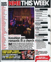
NME is a music magazine which includes all the sub-genres of rock and so includes information on lots of bands. The first thing I notice about the front cover is the colour scheme, white, red and black which connote to rebellion, and is continued throughout the magazine. Rather than their contents page detailing what pages to find the features, NME have listed all the bands mentioned in the magazine and the pages on which to find them. This is because they know that their readers will be very into their music and will want to be able to find the information on their favourite bands straight away. The contents page isn’t actually a full page, merely a column to the side of it, with a large image and news of another band dominating the rest of the page.
On this double page spread, which is in keeping with the set colour scheme of the magazine, there are a couple of large sized images, several medium sized images and a few small ones. This indicates the importance of the band the image is of, and is also indicated through the boldness of the font in the text around the picture.
NME includes music which is of a more indie style and therefore its readers will be slightly different to the ones mentioned previously. A typical audience member will shop at Topshop/ Topman, go to many gigs and festivals and will most likely have a MySpace.

Tuesday 8 December 2009

Research and Planning: Initial Analysis

My task for the main coursework is to produce a music magazine, including a cover, contents page and double page spread. At first I had no idea what genre of magazine I was going to create and so I researched a variety of different types of magazines to help me decide.


I first looked at NME, which stands for “New Music Express”, and is an indie/ rock magazine whose target audience range from teens to 30 year olds. The reader is probably one who is quite intelligent, but has a slight rebellion about them. The magazine appeals to its target audience by using ‘angst’ colours like black and red, and a mix of colloquial and standard English.
BBC Music is a classical music magazine whose audience are likely to be people who have a specific interest in classical music or they may play an instrument themselves. Generally the age of the readers will be older, late 40s/ 50s, however any age group may read it if they have a specific interest in it. The reader is likely to be middle or upper class and is likely to be intelligent. This is someone who is a hard worker and got good, consistent grades at school. To appeal to this audience BBC music has included a sophisticated main font and a well dressed and poised model.
Scratch is a HipHop magazine aimed at 16-25 year olds, the listeners of this genre of music are likely to be males who go out drinking in the streets with a gang. They are most likely to be from a working class background and would wear hoodies. To appeal to this audience the magazine has a main image of a rapper star wearing a hoodie
Blender is a general music magazine, which includes a variety of different music genres to appeal to a wider audience. The magazine is aimed at young men who have a general interest in music. The magazine appeals to the target audience by using seductive pictures of celebrity women and including information on many different artists.

Tuesday 20 October 2009

Evaluation

For this task we were required to create a magazine cover and contents page aimed at students, however as I worked in a group of three we were asked to make two magazine covers. We decided to make food the theme of our magazine as we thought it was different as most food magazines are aimed at an older audience. To incorporate the food idea with the student target it meant we had to research different types of magazines so that when we made our cover it would intergrate both concepts.


The cover was made using photoshop. I took the photograph of the model infront of some green shrubbery, as well as adding bright colours to the cover this also connotes to the healthy eating side of the magazine. The reader can relate to the magazine as the model is the same age as them, she isn't the type of model who you would see on the front of high fashion magazines although she had been edited slightly to make her skin perfect which suggests to the reader that if you read this magazine then you can be happy and look as good as her too. This is similar in the second magazine which sports a young man infront of a brick wall; he looks edgy and cool which appeals to the audience.

We used a modern font for the masthead to catch the readers eye and then used a more sophisticated font and language to appeal to the target audience as we thought the readers would be mainly middle class. We made our main sell catchy and interesting which entices the reader to buy the magazine and also included regular things such as a barcode, issue number, date and price.


We used a programme called Quark Express to make the contents page, however we all felt that this was rushed and therefore not done to the standard we wanted it. We included one large image, which we decided to do as a result of the research we had previously done, and then listed in collumns the contents of the magazine.

Tuesday 6 October 2009

Contents page research

http://farm4.static.flickr.com/3168/3059061502_a7c15eb60b_m.jpg


http://www.stevegiralt.com/blog/wp-content/myfotos/77-food-network-magazine-cover/JM_Spring_09_Drop1_064298.jpg


Both magazine contents pages are laid out in collumns and they also both have large main images, this is a feature which almost all magazine contents pages will have. The page informs the reader of what is included in the magazine in further detail and tells them what page they can find it on.
The magazines appeal to their target audiences by using colloquial language which makes the reader more comfortable with the magazine, this also means that the magazine can be understood by everyone. Also, the contents page is full of short snappy sentences that draw the readers attention to that particular article.
The contents page for both magazines uses the same font throughout the publication, this adds to the keeping of the identity of the magazine.

Friday 18 September 2009

Audience Profile

Our magazine is aimed at:


  • Students aged 16-2o


  • Middle class students


  • Students who are interested in cooking/ food


  • People who regularly visit restaurants, pubs etc.

  • People who are concerned about their diet.

Wednesday 16 September 2009

College Magazine Analysis

Campus Life Magazine
http://www.campuslifemagazine.ca/images/campus_life_magazine_cover_spring2008_large.gif

Bounce Magazine
http://www.mukamo.com/wp-content/uploads/2008/02/iya-villania-bounce.jpg

Latins University Magazine

All the magazines have similar cover images as they all contain one main image which was photographed as a medium close up. However, all of the magazines have different colour schemes, such as 'Campus life' is saturated, 'Bounce' is brightly coloured and perhaps connotes to being in a club and 'Latins university' looks more natural but the white background makes her stand out.

I would prefer to read 'Campus life' as it looks more sophisticated and less trivial compared to the other two. The cover model has been placed on a desaturated background creating a powerful image.

The target audience for this magazine would be young men attending a college or university who are most likely to be aspirers or achievers as they are attending university, and are also therefore most likely to come from a well off background and so are more likely to be middle class.

The model on the magazine looks like an intellectual person, as well as being fashionable with his checked shirt, which as it is red, stands out as the only bit of bright colour on the magazine cover.

The language on the magazine is modern and would appeal to the younger population, particularly the age range of 16 - 19.