
Wednesday 16 December 2009
Mood Board
This is my mood board which contains images connoting to my chosen genre; indie folk. I intend to show this to members of the public within my target audience to see if the board is accurate.

Wednesday 9 December 2009
Research and Planning 2: Detailed Analysis (unfinished)
I intend to create an indie folk magazine, however I couldn't find any magazines within this genre and so I have analysed rock magazines as they have a similar target audience with similar conventions.

Rock sound is a rock magazine which specifically features new music. A typical audience member may generally be a male who plays an instrument and may be in a band. He will most likely wear jeans and a t-shirt and attend many parties but won't dress up for them. He is a hedonist and perhaps someone who is intelligent but probably didn't put in enough effort at school to get the highest grades he could. This person will enjoy finding new music to listen to and his favourite band will be one which produces many albums such as Muse. To appeal to this 'couldn't care less' attitude Rock Sound have included colloquial arrows and vocabulary with large in your face fonts. The colour scheme they have used is Green, white and yellow which are bright, quirky colours which will stand out. They have included a list of many bands, some of which the audience member will not have heard of and will be interested to find out about them. The main sell of this particular issue is an interview with the band Muse, who are also the main image on the cover.
 Rock Tribune is another rock magazine, who include music from the sub-genre metal. The reader of this is likely to be male and, depending on their personality, would either wear jeans and a hoodie or a long black coat. They will most likely have long hair and will aspire to grow some form of a beard if they don't have one already. Their favourite band is likely to be Megadeath and they will spend their time watching Youtube videos, most likely of stunts, and playing games on the Xbox such as World of War Craft. They are quite introvert and will have a social networking site but will rarely use it.
To appeal to their target audience, Rock Tribune have made their magazine simpler and have organizationally laid it out. The front cover has a sophisticated feel to it, which is encouraged throught the use of fonts, this particular issue appears very gothic. This is because the main sell "Nightwish" are a gothic metal band and this is portrayed on the cover through the use of serif font, dark colours and the vampire-esque appearance and pose from the band.
 Kerrang is very similar to Rock Sound, but they will include interviews and information not just on new music, but bands which have been around for a while too. Because this magazine is so similar to Rock Sound, the readers are most likely to have the same qualities. However I think the readers of Kerrang are likely to be into heavier bands and have more of a rebellion about them than readers of Rock Sound. The masthead has been intercepted by the main image, showing that it is a well established magazine. They have used a sans serif font which, teamed with the chatty language used, makes the magazine seem colloqiual.
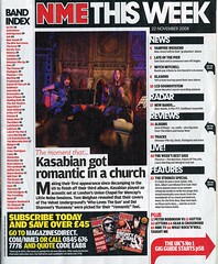
NME is a music magazine which includes all the sub-genres of rock and so includes information on lots of bands. The first thing I notice about the front cover is the colour scheme, white, red and black which connote to rebellion, and is continued throughout the magazine. Rather than their contents page detailing what pages to find the features, NME have listed all the bands mentioned in the magazine and the pages on which to find them. This is because they know that their readers will be very into their music and will want to be able to find the information on their favourite bands straight away. The contents page isn’t actually a full page, merely a column to the side of it, with a large image and news of another band dominating the rest of the page.
On this double page spread, which is in keeping with the set colour scheme of the magazine, there are a couple of large sized images, several medium sized images and a few small ones. This indicates the importance of the band the image is of, and is also indicated through the boldness of the font in the text around the picture.
NME includes music which is of a more indie style and therefore its readers will be slightly different to the ones mentioned previously. A typical audience member will shop at Topshop/ Topman, go to many gigs and festivals and will most likely have a MySpace.
Tuesday 8 December 2009
Research and Planning: Initial Analysis
My task for the main coursework is to produce a music magazine, including a cover, contents page and double page spread. At first I had no idea what genre of magazine I was going to create and so I researched a variety of different types of magazines to help me decide.
 I first looked at NME, which stands for “New Music Express”, and is an indie/ rock magazine whose target audience range from teens to 30 year olds. The reader is probably one who is quite intelligent, but has a slight rebellion about them. The magazine appeals to its target audience by using ‘angst’ colours like black and red, and a mix of colloquial and standard English.
 BBC Music is a classical music magazine whose audience are likely to be people who have a specific interest in classical music or they may play an instrument themselves. Generally the age of the readers will be older, late 40s/ 50s, however any age group may read it if they have a specific interest in it. The reader is likely to be middle or upper class and is likely to be intelligent. This is someone who is a hard worker and got good, consistent grades at school. To appeal to this audience BBC music has included a sophisticated main font and a well dressed and poised model.
 Scratch is a HipHop magazine aimed at 16-25 year olds, the listeners of this genre of music are likely to be males who go out drinking in the streets with a gang. They are most likely to be from a working class background and would wear hoodies. To appeal to this audience the magazine has a main image of a rapper star wearing a hoodie
  Blender is a general music magazine, which includes a variety of different music genres to appeal to a wider audience. The magazine is aimed at young men who have a general interest in music. The magazine appeals to the target audience by using seductive pictures of celebrity women and including information on many different artists.
I first looked at NME, which stands for “New Music Express”, and is an indie/ rock magazine whose target audience range from teens to 30 year olds. The reader is probably one who is quite intelligent, but has a slight rebellion about them. The magazine appeals to its target audience by using ‘angst’ colours like black and red, and a mix of colloquial and standard English. BBC Music is a classical music magazine whose audience are likely to be people who have a specific interest in classical music or they may play an instrument themselves. Generally the age of the readers will be older, late 40s/ 50s, however any age group may read it if they have a specific interest in it. The reader is likely to be middle or upper class and is likely to be intelligent. This is someone who is a hard worker and got good, consistent grades at school. To appeal to this audience BBC music has included a sophisticated main font and a well dressed and poised model.
 Scratch is a HipHop magazine aimed at 16-25 year olds, the listeners of this genre of music are likely to be males who go out drinking in the streets with a gang. They are most likely to be from a working class background and would wear hoodies. To appeal to this audience the magazine has a main image of a rapper star wearing a hoodie
  Blender is a general music magazine, which includes a variety of different music genres to appeal to a wider audience. The magazine is aimed at young men who have a general interest in music. The magazine appeals to the target audience by using seductive pictures of celebrity women and including information on many different artists.
 Tuesday 20 October 2009
Evaluation
For this task we were required to create a magazine cover and contents page aimed at students, however as I worked in a group of three we were asked to make two magazine covers. We decided to make food the theme of our magazine as we thought it was different as most food magazines are aimed at an older audience. To incorporate the food idea with the student target it meant we had to research different types of magazines so that when we made our cover it would intergrate both concepts.
The cover was made using photoshop. I took the photograph of the model infront of some green shrubbery, as well as adding bright colours to the cover this also connotes to the healthy eating side of the magazine. The reader can relate to the magazine as the model is the same age as them, she isn't the type of model who you would see on the front of high fashion magazines although she had been edited slightly to make her skin perfect which suggests to the reader that if you read this magazine then you can be happy and look as good as her too. This is similar in the second magazine which sports a young man infront of a brick wall; he looks edgy and cool which appeals to the audience.
We used a modern font for the masthead to catch the readers eye and then used a more sophisticated font and language to appeal to the target audience as we thought the readers would be mainly middle class. We made our main sell catchy and interesting which entices the reader to buy the magazine and also included regular things such as a barcode, issue number, date and price.
We used a programme called Quark Express to make the contents page, however we all felt that this was rushed and therefore not done to the standard we wanted it. We included one large image, which we decided to do as a result of the research we had previously done, and then listed in collumns the contents of the magazine.
Tuesday 13 October 2009


Tuesday 6 October 2009
Contents page research
http://farm4.static.flickr.com/3168/3059061502_a7c15eb60b_m.jpg
http://www.stevegiralt.com/blog/wp-content/myfotos/77-food-network-magazine-cover/JM_Spring_09_Drop1_064298.jpg
Both magazine contents pages are laid out in collumns and they also both have large main images, this is a feature which almost all magazine contents pages will have. The page informs the reader of what is included in the magazine in further detail and tells them what page they can find it on.
The magazines appeal to their target audiences by using colloquial language which makes the reader more comfortable with the magazine, this also means that the magazine can be understood by everyone. Also, the contents page is full of short snappy sentences that draw the readers attention to that particular article.
The contents page for both magazines uses the same font throughout the publication, this adds to the keeping of the identity of the magazine.
Friday 18 September 2009
Audience Profile
Our magazine is aimed at:
- Students aged 16-2o
- Middle class students
- Students who are interested in cooking/ food
- People who regularly visit restaurants, pubs etc.
- People who are concerned about their diet.
Wednesday 16 September 2009
College Magazine Analysis
Campus Life Magazine
http://www.campuslifemagazine.ca/images/campus_life_magazine_cover_spring2008_large.gif
Bounce Magazine
http://www.mukamo.com/wp-content/uploads/2008/02/iya-villania-bounce.jpg
Latins University Magazine
All the magazines have similar cover images as they all contain one main image which was photographed as a medium close up. However, all of the magazines have different colour schemes, such as 'Campus life' is saturated, 'Bounce' is brightly coloured and perhaps connotes to being in a club and 'Latins university' looks more natural but the white background makes her stand out.
I would prefer to read 'Campus life' as it looks more sophisticated and less trivial compared to the other two. The cover model has been placed on a desaturated background creating a powerful image.
The target audience for this magazine would be young men attending a college or university who are most likely to be aspirers or achievers as they are attending university, and are also therefore most likely to come from a well off background and so are more likely to be middle class.
The model on the magazine looks like an intellectual person, as well as being fashionable with his checked shirt, which as it is red, stands out as the only bit of bright colour on the magazine cover.
The language on the magazine is modern and would appeal to the younger population, particularly the age range of 16 - 19.
Subscribe to:
Posts (Atom)