For this task we were required to create a magazine cover and contents page aimed at students, however as I worked in a group of three we were asked to make two magazine covers. We decided to make food the theme of our magazine as we thought it was different as most food magazines are aimed at an older audience. To incorporate the food idea with the student target it meant we had to research different types of magazines so that when we made our cover it would intergrate both concepts.
The cover was made using photoshop. I took the photograph of the model infront of some green shrubbery, as well as adding bright colours to the cover this also connotes to the healthy eating side of the magazine. The reader can relate to the magazine as the model is the same age as them, she isn't the type of model who you would see on the front of high fashion magazines although she had been edited slightly to make her skin perfect which suggests to the reader that if you read this magazine then you can be happy and look as good as her too. This is similar in the second magazine which sports a young man infront of a brick wall; he looks edgy and cool which appeals to the audience.
We used a modern font for the masthead to catch the readers eye and then used a more sophisticated font and language to appeal to the target audience as we thought the readers would be mainly middle class. We made our main sell catchy and interesting which entices the reader to buy the magazine and also included regular things such as a barcode, issue number, date and price.
We used a programme called Quark Express to make the contents page, however we all felt that this was rushed and therefore not done to the standard we wanted it. We included one large image, which we decided to do as a result of the research we had previously done, and then listed in collumns the contents of the magazine.
Tuesday 20 October 2009
Tuesday 13 October 2009


Tuesday 6 October 2009
Contents page research
http://farm4.static.flickr.com/3168/3059061502_a7c15eb60b_m.jpg
http://www.stevegiralt.com/blog/wp-content/myfotos/77-food-network-magazine-cover/JM_Spring_09_Drop1_064298.jpg
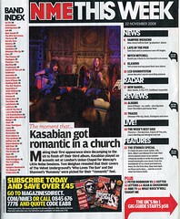
Both magazine contents pages are laid out in collumns and they also both have large main images, this is a feature which almost all magazine contents pages will have. The page informs the reader of what is included in the magazine in further detail and tells them what page they can find it on.
The magazines appeal to their target audiences by using colloquial language which makes the reader more comfortable with the magazine, this also means that the magazine can be understood by everyone. Also, the contents page is full of short snappy sentences that draw the readers attention to that particular article.
The contents page for both magazines uses the same font throughout the publication, this adds to the keeping of the identity of the magazine.
http://www.stevegiralt.com/blog/wp-content/myfotos/77-food-network-magazine-cover/JM_Spring_09_Drop1_064298.jpg
Both magazine contents pages are laid out in collumns and they also both have large main images, this is a feature which almost all magazine contents pages will have. The page informs the reader of what is included in the magazine in further detail and tells them what page they can find it on.
The magazines appeal to their target audiences by using colloquial language which makes the reader more comfortable with the magazine, this also means that the magazine can be understood by everyone. Also, the contents page is full of short snappy sentences that draw the readers attention to that particular article.
The contents page for both magazines uses the same font throughout the publication, this adds to the keeping of the identity of the magazine.
Subscribe to:
Posts (Atom)